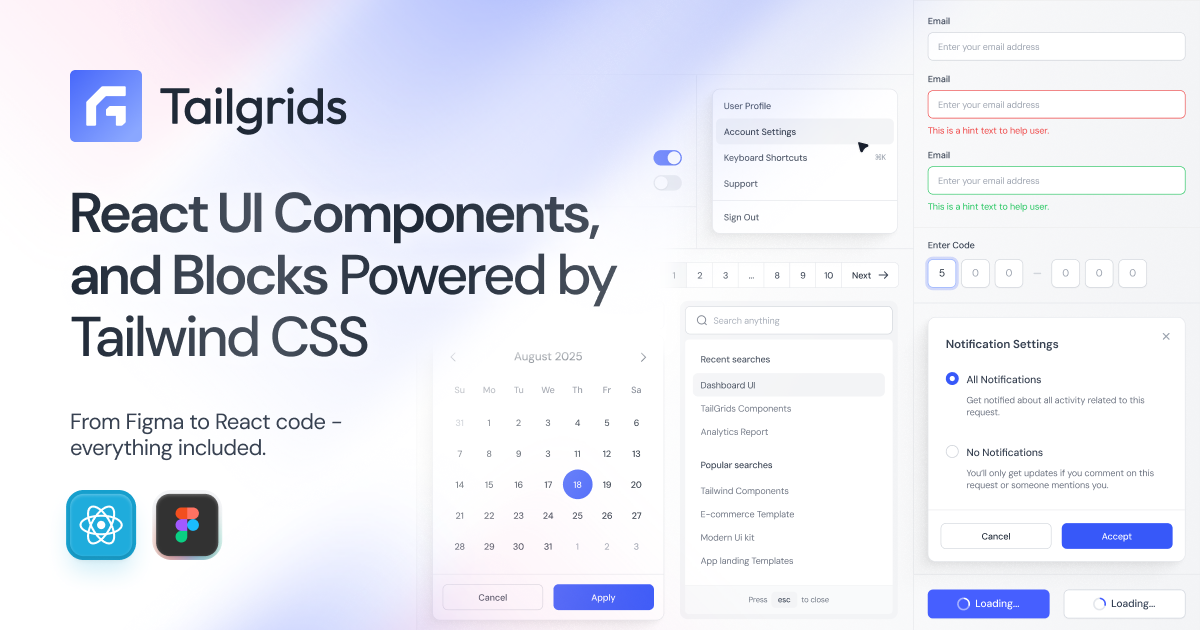
Tailgrids UI
Tailgrids UI is an open-source React + Tailwind component library with 600+ components, blocks, templates and a full Figma design system.
What is Tailgrids UI?
Tailgrids UI is an open-source React component library and design system built with Tailwind CSS. It provides reusable UI components, blocks, and templates—along with a Figma design system—so teams can build consistent, production-ready interfaces faster.
The core purpose is to unify design-to-development workflows by shipping both React code and Figma assets, with Tailwind-based styling and theming to support modern web app development.
Key Features
- 600+ React UI components, blocks, and templates (free and pro): A large set of production-oriented building blocks for common product UI needs.
- Figma design system with tokens and variants (900+ components): A Figma library intended to support consistent design-to-development handoff.
- Light and dark theme support: Built-in themes aligned with system preferences to keep component behavior consistent across modes.
- CLI tooling for scaffolding and standardization: Use the Tailgrids CLI to initialize projects and add components, helping teams keep patterns consistent.
- Responsive, performance- and accessibility-aware components: Components are described as responsive and optimized for production use, with attention to accessibility and consistency.
How to Use Tailgrids UI
- Initialize a project with the CLI (the site references
npx @tailgrids/cli@latest init) to set up a Tailgrids UI-ready workflow. - Browse and select components, blocks, or templates to match the UI you need (the site includes separate browsing for components and templates).
- Integrate the chosen components into your React + Tailwind project using the library’s predictable component structure and minimal configuration approach described on the page.
Use Cases
- Marketing and landing pages: Use React + Tailwind marketing blocks and templates to assemble consistent page sections.
- E-commerce interfaces: Combine reusable UI components and templates to build storefront pages and related flows.
- Dashboards and analytics UIs: Leverage dashboard-oriented blocks and components to create analytics screens with consistent layout patterns.
- AI product marketing and documentation sites: Use AI-themed templates that include sections such as features, pricing, docs/support, and other common marketing structure.
- Team design-to-development workflow alignment: Use the Figma design system (components, tokens, variants) alongside the React system to reduce drift between design and implementation.
FAQ
-
Is Tailgrids UI only for React? The library is presented as a React component library built with Tailwind CSS, with the design system also provided in Figma.
-
What styling approach does Tailgrids UI use? It is built with Tailwind CSS and ships components styled using Tailwind’s utility-first approach.
-
Does Tailgrids UI include a design system in Figma? Yes. The page describes a Figma design system including components, tokens, and variants.
-
How do I get started with Tailgrids UI in a new project? The site references CLI tooling, including initialization via
npx @tailgrids/cli@latest init. -
Are the components responsive and theme-aware? The page states components are fully responsive and include light/dark theme support.
Alternatives
- Other Tailwind-based React UI libraries: These offer ready-made React components styled with Tailwind, but may not provide a parallel Figma design system workflow.
- General React component frameworks without a unified Figma system: Useful for UI speed, but you may need to manage design-token alignment separately.
- Standalone template starter kits for React + Tailwind: Helpful for bootstrapping pages quickly, but typically focus more on templates than a comprehensive component library plus Figma tokens/variants.
Alternatives
MakerLoft
MakerLoft is an AI app builder for non-developers that connects to your GitHub repo to generate working apps with auth, payments, files, jobs.
Ably Chat
Ably Chat is a chat API and SDKs for building custom realtime chat apps, with reactions, presence, and message edit/delete.
ClawTick
ClawTick is a CLI-first AI agent automation platform for scheduling webhook tasks on cron with monitoring, alerts, retries, and execution logs.
Falconer
Falconer is a self-updating knowledge platform for high-speed teams to write, share, and find reliable internal documentation and code context in one place.
OpenFlags
OpenFlags is an open source, self-hosted feature flag system with a control plane and typed SDKs for progressive delivery and safe rollouts.
AakarDev AI
AakarDev AI is a powerful platform that simplifies the development of AI applications with seamless vector database integration, enabling rapid deployment and scalability.