shadcn/ui Design Ecosystem
A comprehensive design and development ecosystem providing 2,000+ shadcn/ui Figma components, Pro Blocks, templates, and a code-exporting Figma plugin to accelerate building with shadcn/ui and Next.js.
What is shadcn/ui Design Ecosystem?
What is shadcn/ui Design Ecosystem?
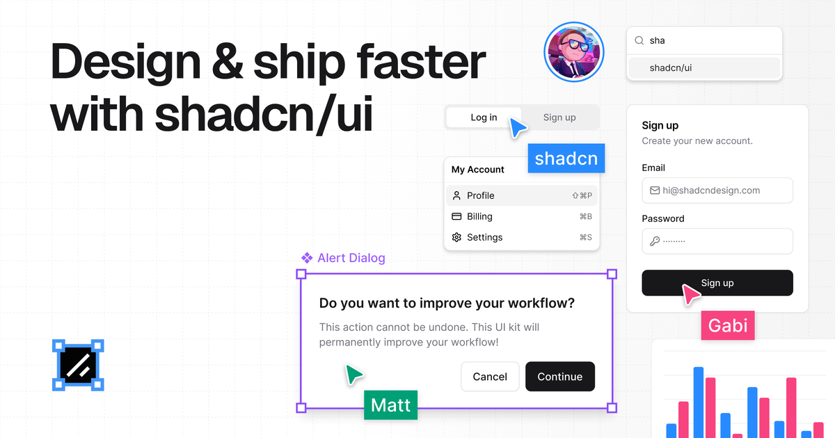
The shadcn/ui Design Ecosystem is the ultimate resource suite built specifically to bridge the gap between design and development when working with the popular shadcn/ui component library. Created by Matt Wierzbicki, who has extensive experience building large-scale design systems, this ecosystem addresses the common pain point of outdated or poorly maintained resources for shadcn/ui in design tools like Figma.
This ecosystem provides pixel-perfect Figma components, production-ready React blocks (Pro Blocks), comprehensive documentation, and an intelligent Figma plugin that ensures perfect alignment between the design file and the generated, clean shadcn/ui code. It is designed for designers, developers, and teams aiming to ship high-quality, modern applications faster by eliminating friction and ensuring design consistency from concept to deployment.
Key Features
- Pixel-Perfect Figma Kit: Over 2,000 customizable components, charts, and assets meticulously crafted to match the exact structure and styling of official shadcn/ui components, leveraging Auto-layout and Tailwind CSS variables.
- Figma to shadcn/ui Plugin: A powerful plugin that converts selected Figma elements directly into clean, production-ready shadcn/ui code, saving significant development time and eliminating design-to-code mismatches.
- Production-Ready Pro Blocks: Pre-built, high-quality layout blocks (e.g., Landing Pages, Banners, Testimonials) available as both Figma components and corresponding shadcn/ui/Next.js code for lightning-fast assembly.
- AI-Ready Design System: Components designed with structure and accessibility best practices in mind, ensuring compatibility with modern tooling and workflows.
- Comprehensive Academy & Documentation: Extensive learning resources, including step-by-step video courses and detailed documentation, enabling rapid onboarding and self-sufficiency for teams.
- Endorsed by shadcn/ui Creator: Verified and highly recommended by the creator of shadcn/ui as the definitive resource.
How to Use shadcn/ui Design Ecosystem
Getting started with the ecosystem involves integrating its components across your design and development workflow:
- Design Phase (Figma Kit): Designers access the extensive Figma library to build interfaces using components that are guaranteed to mirror the underlying code structure, ensuring pixel-perfect alignment.
- Code Generation (Figma Plugin): Utilize the dedicated Figma plugin to select completed designs or components and instantly generate clean, accessible shadcn/ui code snippets, including styles and variables.
- Development Acceleration (Pro Blocks): Developers integrate the production-ready Pro Blocks directly into their Next.js projects. These blocks cover common layouts like navigation bars, feature sections, and pricing tables, allowing teams to skip building boilerplate layouts.
- Learning & Support: Leverage the Academy and Documentation to master best practices for using shadcn/ui, managing themes, and optimizing the design-to-code handoff process.
This integrated approach ensures that designers focus on UX and conversion, while developers focus on logic, as the component fidelity is maintained automatically.
Use Cases
This ecosystem is invaluable for various roles and project types:
- Rapid Prototyping & MVP Launch: Teams needing to launch a high-fidelity MVP quickly can use the Pro Blocks and pre-built templates (Landing Pages, Application UI) to establish a professional design foundation in days, not weeks.
- Enterprise Design System Maintenance: Companies standardizing on shadcn/ui can use the kit to maintain strict visual consistency across multiple products, ensuring all designers adhere to the exact specifications developers are coding against.
- Freelancers and Agencies: Agencies can significantly reduce client iteration cycles by presenting pixel-perfect mockups that translate directly to code, improving client satisfaction and project profitability.
- Developer Onboarding: New developers joining a project using shadcn/ui can quickly ramp up by referencing the component structure within Figma and utilizing the code export feature for immediate implementation.
- Complex Data Visualization: Utilizing the included chart components within Figma ensures that complex data displays are designed accurately and translate seamlessly into functional React charts.
FAQ
Q: Is this product compatible with standard Tailwind CSS projects, or only Next.js? A: While the ecosystem is heavily optimized for the shadcn/ui + Next.js stack, the core principles—pixel-perfect component structure and Tailwind alignment—benefit any project utilizing Tailwind CSS. The code export feature specifically targets clean shadcn/ui component syntax.
Q: How often are the Figma components updated to match new shadcn/ui releases? A: The creator commits to keeping the ecosystem constantly updated. Since the creator is deeply involved in maintaining the resources, users can expect timely updates to reflect changes or additions in the core shadcn/ui library.
Q: What is the refund policy for the one-time payment? A: The product offers a 14-day refund policy, allowing users to evaluate the kit and ensure it meets their needs risk-free.
Q: Can multiple members of my team use a single purchase? A: The purchase grants access to the ecosystem for the purchasing entity (team or individual). For large organizational use, it is best to review their specific licensing terms, but the goal is to streamline collaboration across the entire team.
Q: Does the plugin require an active internet connection to generate code? A: Yes, the Figma plugin functions by processing the design data and generating the corresponding code structure, typically requiring an active connection to function correctly.
Alternatives
Devin
Devin is an AI coding agent and software engineer that helps developers build better software faster.
imgcook
imgcook is an intelligent tool that converts design mockups into high-quality, production-ready code with a single click.
Radian
Radian is an innovative, open-source design and development library tailored for building high-quality, scalable web applications. Built using React, Radix, and Tailwind CSS, Radian provides developers with a comprehensive set of components, animations, and blocks that streamline the process of creating modern, responsive user interfaces. Its focus on speed, scale, and simplicity makes it an ideal choice for teams aiming to accelerate their development workflows while maintaining design consistency. The library is designed to facilitate seamless design-to-code synchronization, allowing changes made in design tools like Figma to be easily reflected in the codebase. This ensures pixel-perfect accuracy and reduces the time spent on manual adjustments. Radian's modular architecture and high-quality base components enable developers to quickly assemble robust applications without sacrificing flexibility or quality. Whether you are building new projects from scratch or enhancing existing ones, Radian offers a rich ecosystem of components, animations, and design blocks that cater to diverse development needs. Its open-source nature encourages community contributions and continuous improvement, making it a future-proof solution for modern web development.
SkillKit
SkillKit provides a universal set of skills allowing developers to write code instructions once and deploy them across 32 different AI coding agents, ensuring consistency and broad compatibility.
腾讯扣叮
Tencent Kouding is a platform that integrates various programming tools and resources, aimed at helping developers enhance their programming skills and project management capabilities.
CodeSandbox
CodeSandbox is a cloud development platform that empowers developers to code, collaborate and ship projects of any size from any device in record time.