
UI icon library
Browse 85,000+ UI icons in 13 styles. Stroke is free under the MIT licence, while Pro opens the complete style collection; icons are available with round or sharp corners.

IconOven combines an 85,000+ UI icon library with original app icon designs for iOS, Android, macOS, and web. Designers and developers can use the free MIT-licensed Stroke set or access additional styles through paid plans and integrations for major frameworks, editors, and design tools.
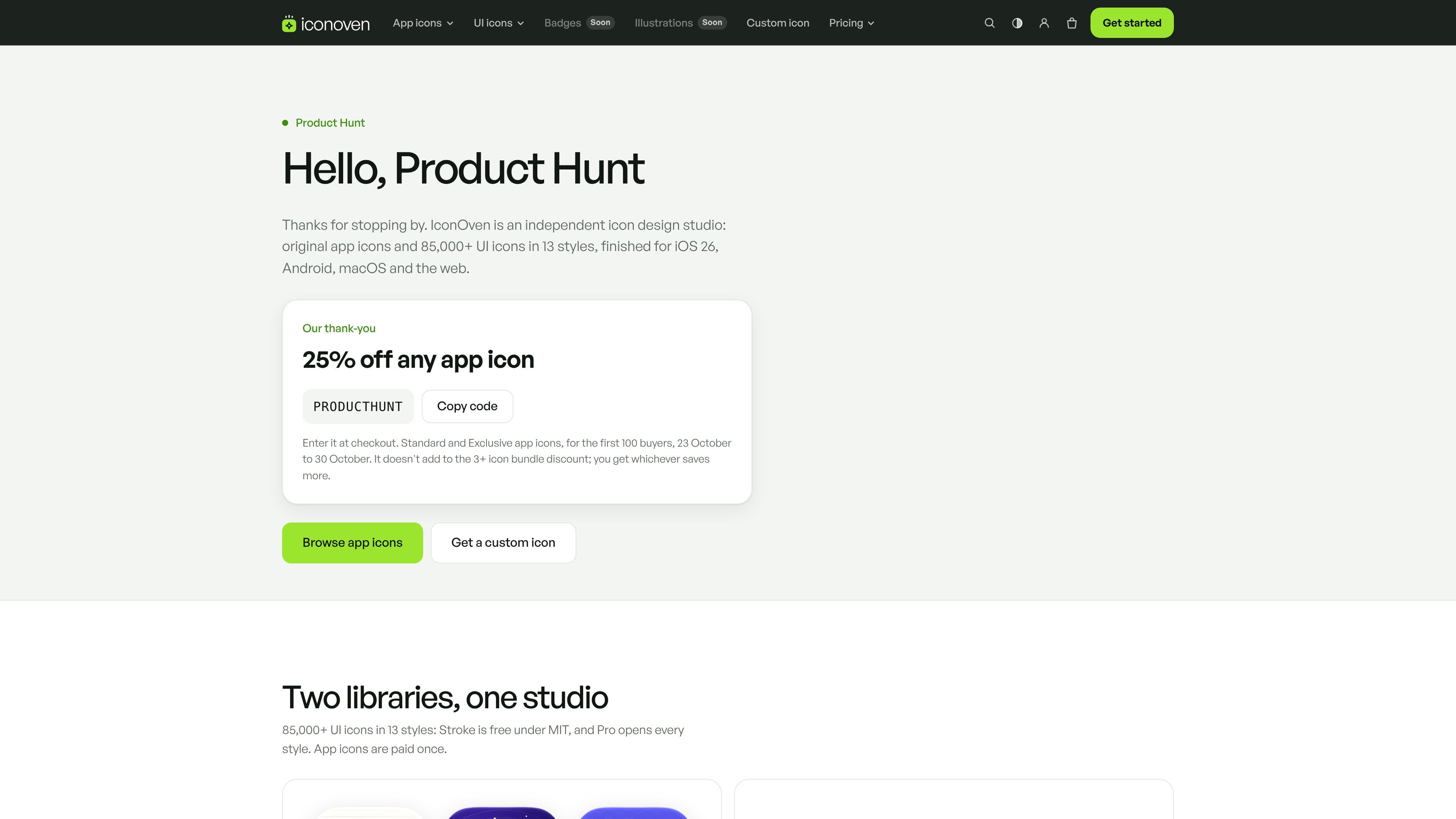
IconOven is an icon studio and library for product designers and developers. It combines a collection of more than 85,000 UI icons in 13 styles with a separate catalogue of original app icon designs for iOS, Android, macOS, and web projects.
The UI library can be copied or installed in design and development workflows, while the app-icon catalogue provides ready-to-ship design variants and a full kit for each listed icon. A free Stroke collection is available under the MIT licence; paid Pro and Max plans expand the UI styles and add features such as source files, custom icon requests, and a CI key.
Browse 85,000+ UI icons in 13 styles. Stroke is free under the MIT licence, while Pro opens the complete style collection; icons are available with round or sharp corners.
Choose from 53 original app icon designs. Each listed design has light, dark, tinted, and clear versions, and the site presents them for iOS, Android, macOS, and web use.
Use framework packages and other technical formats, including React, Vue, Svelte, Solid, Preact, Angular, React Native, web components, SVG, and an icon font. Components expose controls such as size, colour, stroke width, title, and style variant.
Add the Swift package through Swift Package Manager for SwiftUI, UIKit, and AppKit. The documented package supports iOS 15, macOS 12, watchOS 8, tvOS 15, and visionOS 1 or later.
Use the library from Flutter and Jetpack Compose, or work through VS Code, Open VSX, Figma, and Iconify integrations. The site also provides browser-based App Icon Exporter, App Icon Score, and App Icon Sizes tools.
Use the free Stroke set as SVG, JSX, an icon font, or a framework package when a project needs a permissively licensed baseline icon system without an account.
Install the relevant npm package or use the Swift, Flutter, or Android distribution to add named icons directly to an application while controlling size, colour, stroke weight, and accessibility titles where supported.
Use the app-icon catalogue when a product needs a supplied visual direction across light, dark, tinted, and clear presentations for mobile, desktop, and web placements.
Use Figma, VS Code, Open VSX, or Iconify when icon selection and insertion need to happen inside an existing design or coding environment rather than through a separate download workflow.
The free tier includes every icon in the Stroke style, with round and sharp corners, under the MIT licence. It can be used without an account. Pro adds all 13 styles, while Max also includes the Figma source file, icons drawn on request, and a CI build key.
UI icons can be installed through framework-specific npm packages, used as SVG files or an icon font, or added through the Swift Package Manager, Flutter, Android, VS Code, Figma, and Iconify integrations described in the documentation.
The documented npm packages support React, Vue, Svelte, Solid, Preact, Angular, React Native, web components, and plain JavaScript. The packages provide named icon components or icon data, and the icons accept properties such as size, colour, stroke width, title, and variant.
Pro and Max are billed yearly. A seat represents one person using the icons in design files or code; Max's CI key is for build servers and does not use a seat. The pricing page lists one-, five-, and 25-seat options, with larger teams directed to contact IconOven.