shadcndesign.com
shadcndesign.com offers a shadcn/ui-focused Figma ecosystem: customizable Figma kit, export plugin to shadcn/ui code, Pro Blocks, templates & learning.
What is shadcn/ui kit for Figma?
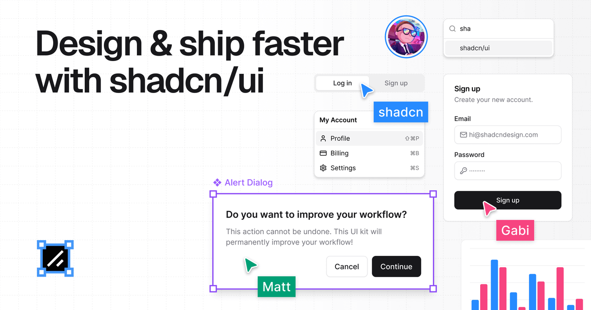
shadcndesign.com offers an ecosystem of shadcn/ui-related resources built for designers and developers working with the shadcn/ui component system. It combines a Figma kit, a Figma-to-code plugin, and production-ready Pro Blocks, along with templates and an Academy/Documentation for learning the workflow.
The core purpose is to reduce design-to-development mismatches by ensuring components and tokens line up between Figma and shadcn/ui, while also speeding up component creation and layout building with ready-made blocks.
Key Features
- Customizable Figma kit (components, charts, assets) based on shadcn/ui: Provides pixel-perfect Figma components intended to match the shadcn/ui implementation.
- Figma plugin that converts designs to shadcn/ui code: Lets you generate React component code from selected Figma elements, aiming for clean structure and best practices.
- Automatic handling of styles, variants, and Tailwind CSS alignment: Uses auto-layout, variants, and Tailwind CSS variables to keep design and development in sync.
- Production-ready Pro Blocks (Figma components + shadcn/ui code): Prebuilt blocks for common UI layouts and sections to avoid building from scratch.
- Agent Skills for AI tools workflows: Provides curated skill files so AI agents (e.g., Claude, Cursor, Codex) can turn Figma frames into shadcn/ui components and sync design tokens.
- Templates and documentation/Academy: Includes templates (e.g., common page/section patterns) plus documentation and a step-by-step video series for the Figma-to-shadcn/ui process.
How to Use shadcn/ui kit for Figma
- Start with the Figma kit: Use the provided Figma components, charts, and assets that are based on shadcn/ui.
- Use the plugin to generate code: In Figma, select elements or point an AI agent at a frame to generate production-ready shadcn/ui + React component output.
- Install and use Pro Blocks: Add the ready-to-use blocks in Figma and/or use their corresponding shadcn/ui code to build layouts faster.
- Follow the Academy/Documentation: Use the provided learning resources to understand the full Figma-to-shadcn/ui workflow.
Use Cases
- Designer creates a pixel-aligned UI in Figma: Build screens with the shadcn/ui-matching components so Tailwind CSS variables and variants are consistent with what developers expect.
- Developer converts a finalized Figma section into components: Select a Figma element and export production-ready shadcn/ui code with the plugin, aiming to reduce manual wiring.
- Team standardizes on one component system: Use the shared ecosystem (Figma kit + Pro Blocks + templates) so designers and developers work from the same shadcn/ui-aligned building blocks.
- AI-assisted component generation from design frames: Point an AI agent at a Figma frame to generate a component mapped to existing shadcn/ui components and install missing ones while downloading assets.
- Faster page assembly using prebuilt blocks: Use Pro Blocks and templates (e.g., landing page and section patterns) to assemble complete UI flows rather than creating each layout from scratch.
FAQ
-
What does the Figma plugin do? It converts your Figma designs into clean, production-ready shadcn/ui code, including generating components from selected elements and handling style export.
-
Does the Figma kit match shadcn/ui components? The kit is described as mirroring shadcn/ui code, with emphasis on auto-layout, variants, and Tailwind CSS variable alignment.
-
Can I use Pro Blocks without the plugin? Pro Blocks are available both as Figma components and as production-ready shadcn/ui code, so you can use them directly in either workflow.
-
How are AI tools used with this ecosystem? Agent Skills provide curated skill files to help AI tools (mentioned: Claude, Cursor, Codex) follow a workflow for generating shadcn/ui components and syncing design tokens.
Alternatives
- Generic UI kits for Figma (non shadcn/ui-specific): Useful for general design libraries, but they may not mirror shadcn/ui code structure or provide the same Figma-to-code workflow.
- Separate design-to-code converters: Tools that export Figma designs into React can help automate output, but may not be tailored to shadcn/ui component conventions and token mapping.
- Documentation-only approaches: Teams can implement shadcn/ui manually from documentation, which avoids a kit/plugin, but typically requires more alignment work between design tokens and component usage.
- Standalone shadcn/ui component libraries: Developers can rely only on code components (without the Figma kit), but designers may need additional effort to keep visuals aligned with the implementation.
Alternatives
imgcook
imgcook is an intelligent tool that converts design mockups into high-quality, production-ready code with a single click.
FigPrompt
FigPrompt is an AI Figma plugin builder that generates production-ready plugin logic from your description—no code, in seconds.
Ably Chat
Ably Chat is a chat API and SDKs for building custom realtime chat apps, with reactions, presence, and message edit/delete.
Make Real
Draw a UI and make it real using the tldraw SDK.
AakarDev AI
AakarDev AI is a powerful platform that simplifies the development of AI applications with seamless vector database integration, enabling rapid deployment and scalability.
DeepMotion
DeepMotion is an AI motion capture and body-tracking platform to generate 3D animations from video (and text) in your web browser, via Animate 3D API.