
Loading...
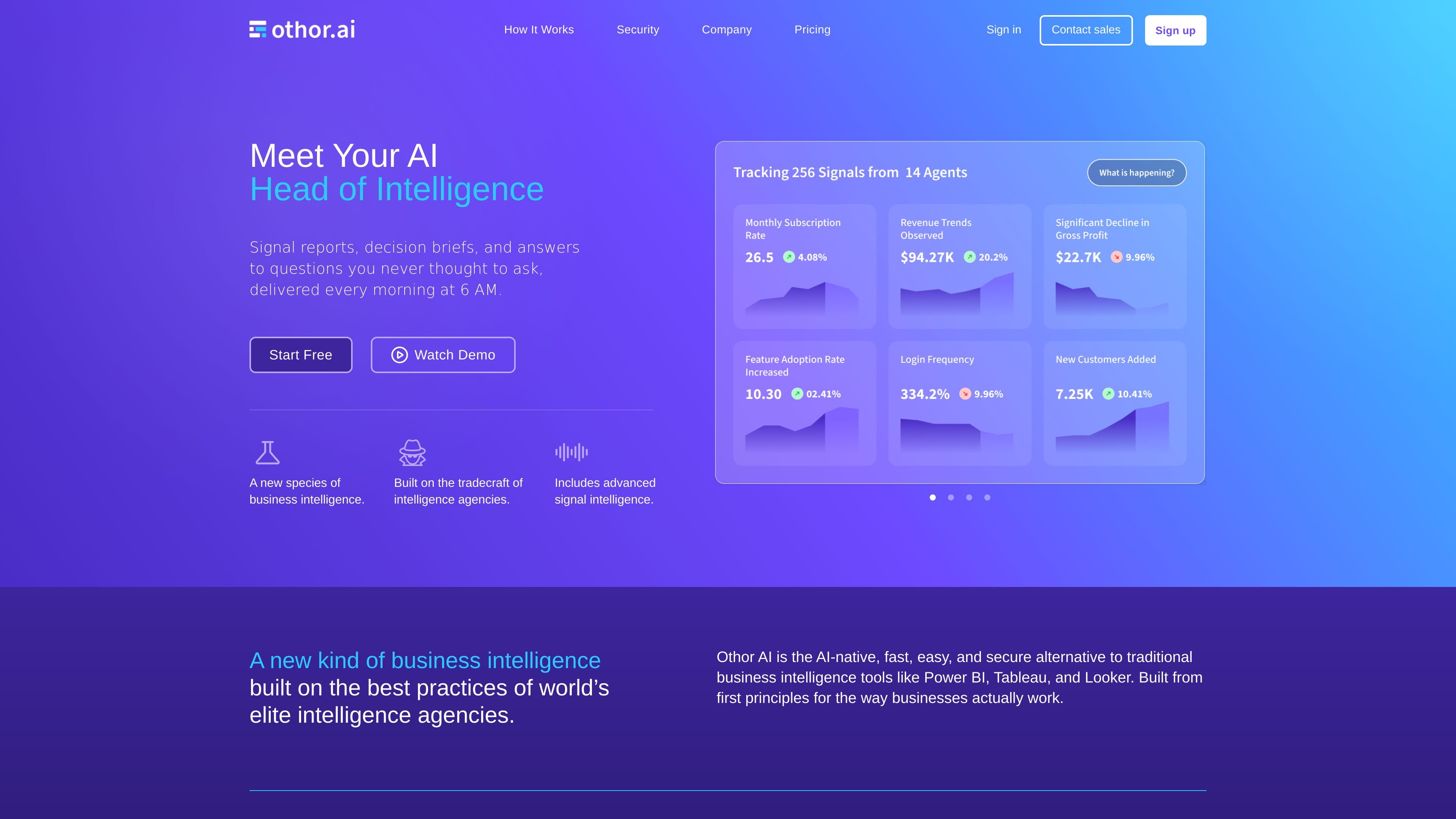

Othor AI is an AI-native business intelligence platform that connects to business data, automatically discovers metrics, and turns them into daily reports, dashboards, briefs, and chat responses. It is designed for teams that want automated analytics without building a traditional BI workflow.
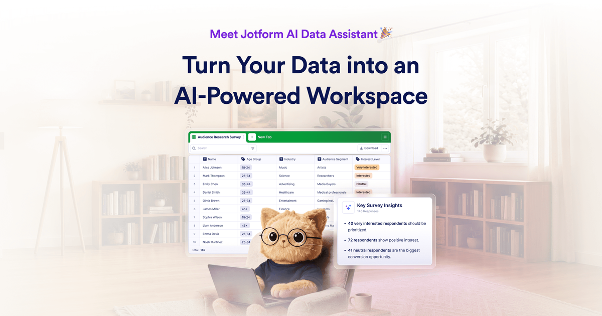

Jotform AI Data Assistant is an AI-powered workspace for analyzing collected data, building tables, and managing submission follow-up inside Jotform. It helps users turn plain-language requests into summaries, charts, and table actions.

Mermaid Studio for Confluence lets teams write Mermaid diagrams as text inside Confluence and render them live. It supports templates, validation, export options, and browser-side rendering with no scopes requested.
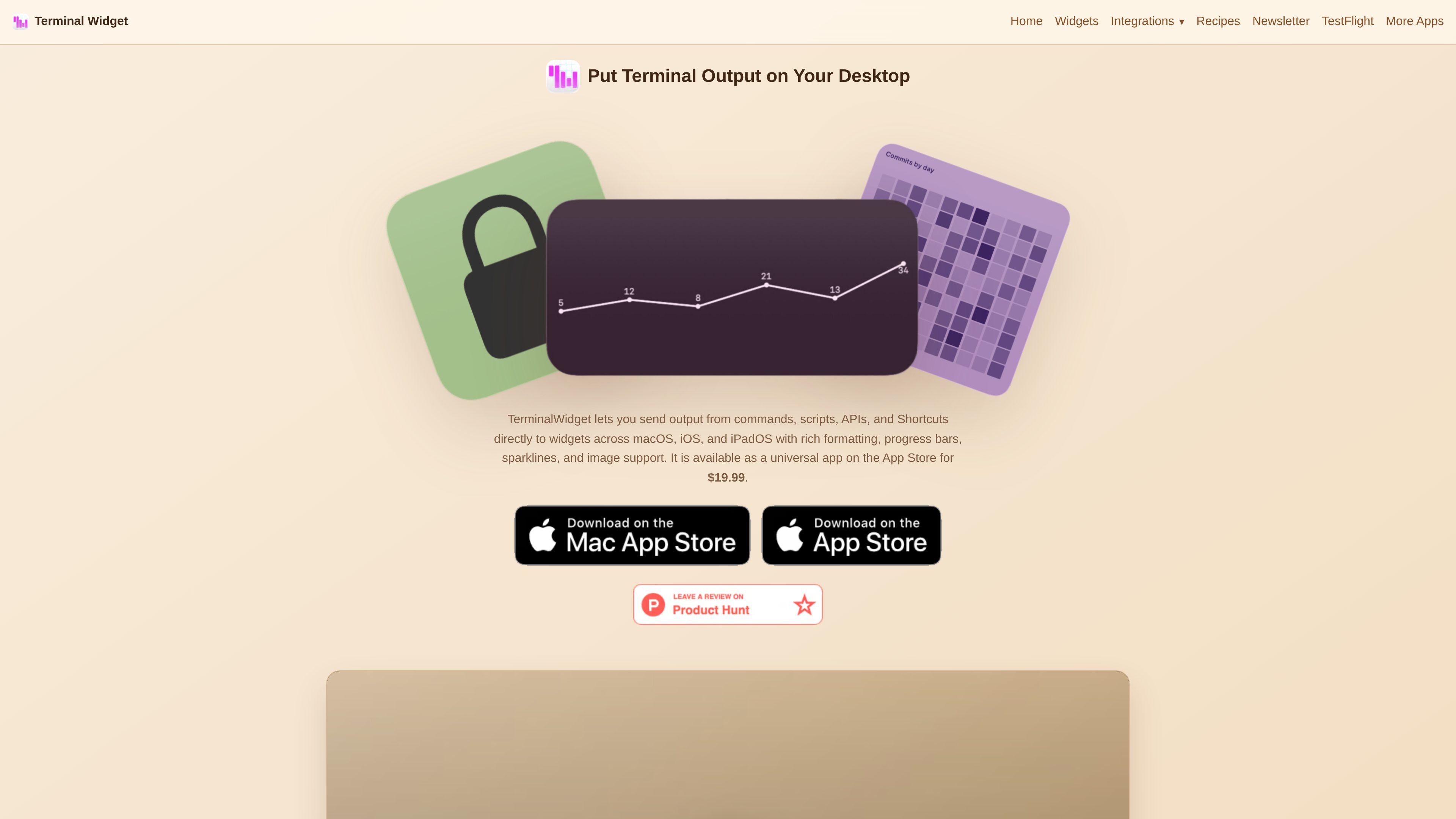

TerminalWidget is a widget automation app for macOS, iOS, and iPadOS that displays terminal output, charts, progress, images, and other structured data in customizable widgets. It supports CLI, Shortcuts, and a custom URL scheme for updating widgets from scripts and automations.
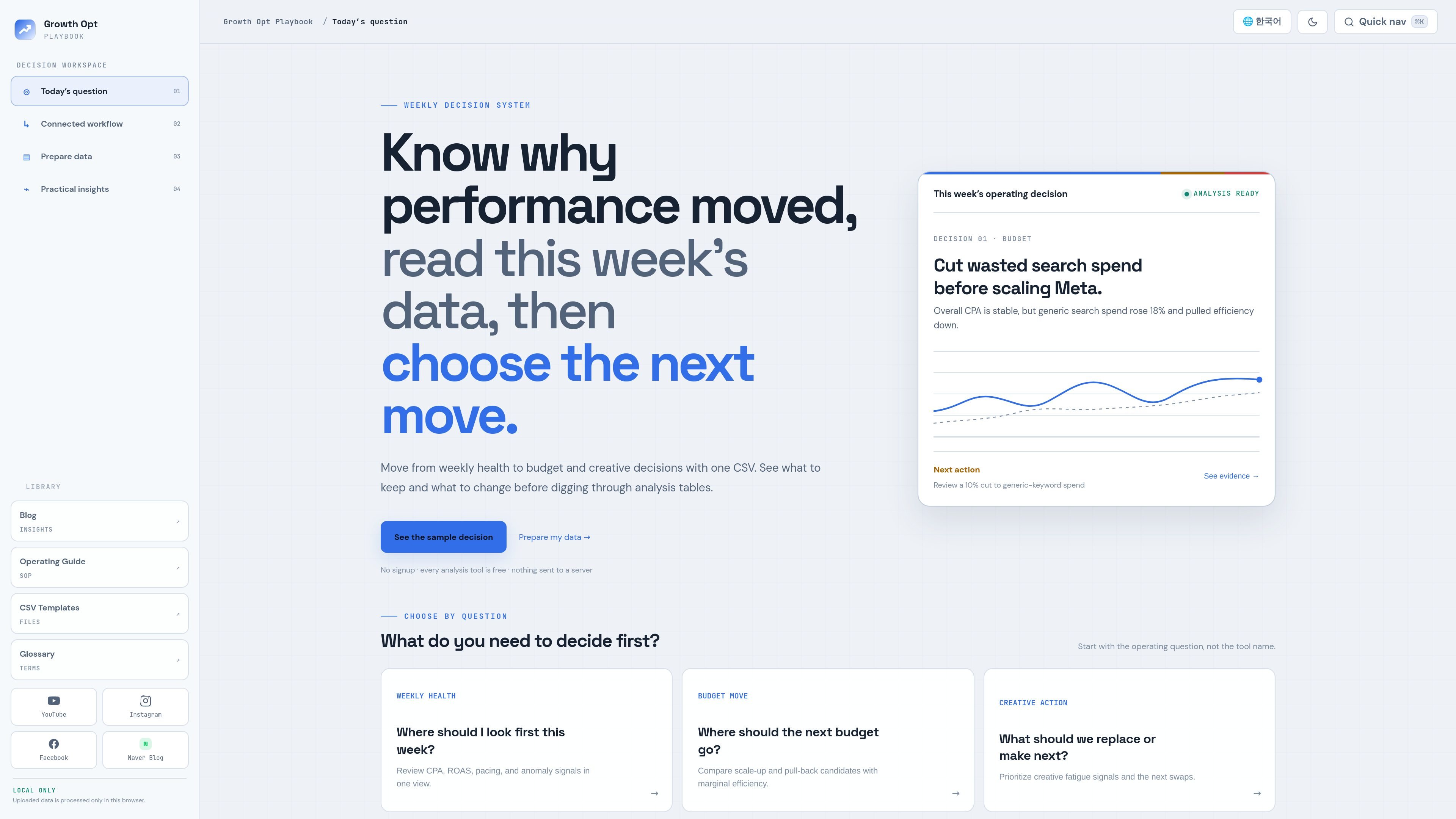

Growth Opt Playbook is a free browser-based marketing data analysis toolkit for performance marketers. It supports CSV uploads and Google Sheets workflows to review campaign health, budget allocation, creative performance, and experiment results.
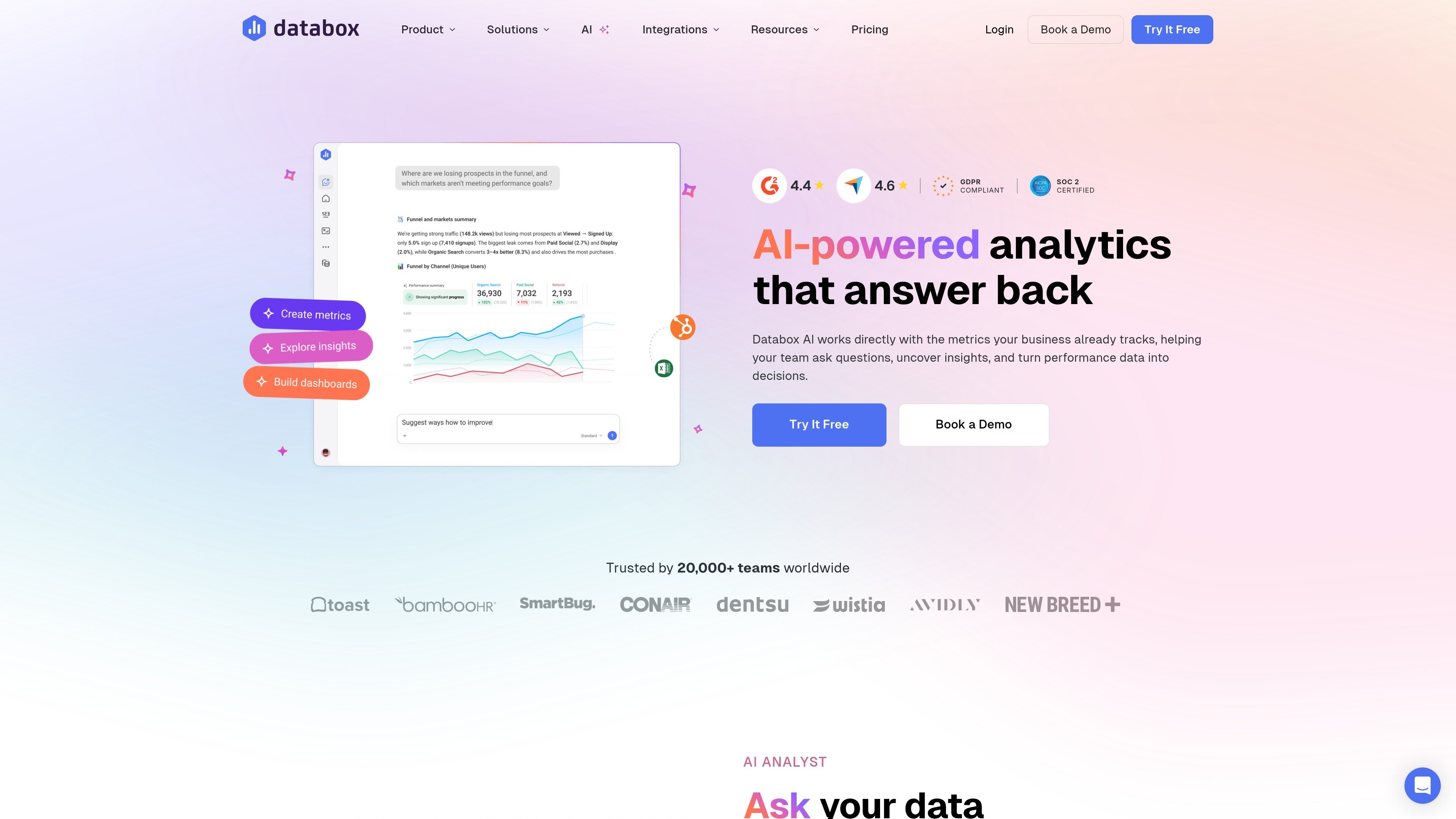

Databox AI is an analytics layer for asking performance questions in plain language and getting answers grounded in connected business metrics. It helps teams analyze data, summarize changes, and use trusted Databox metrics inside external AI tools.
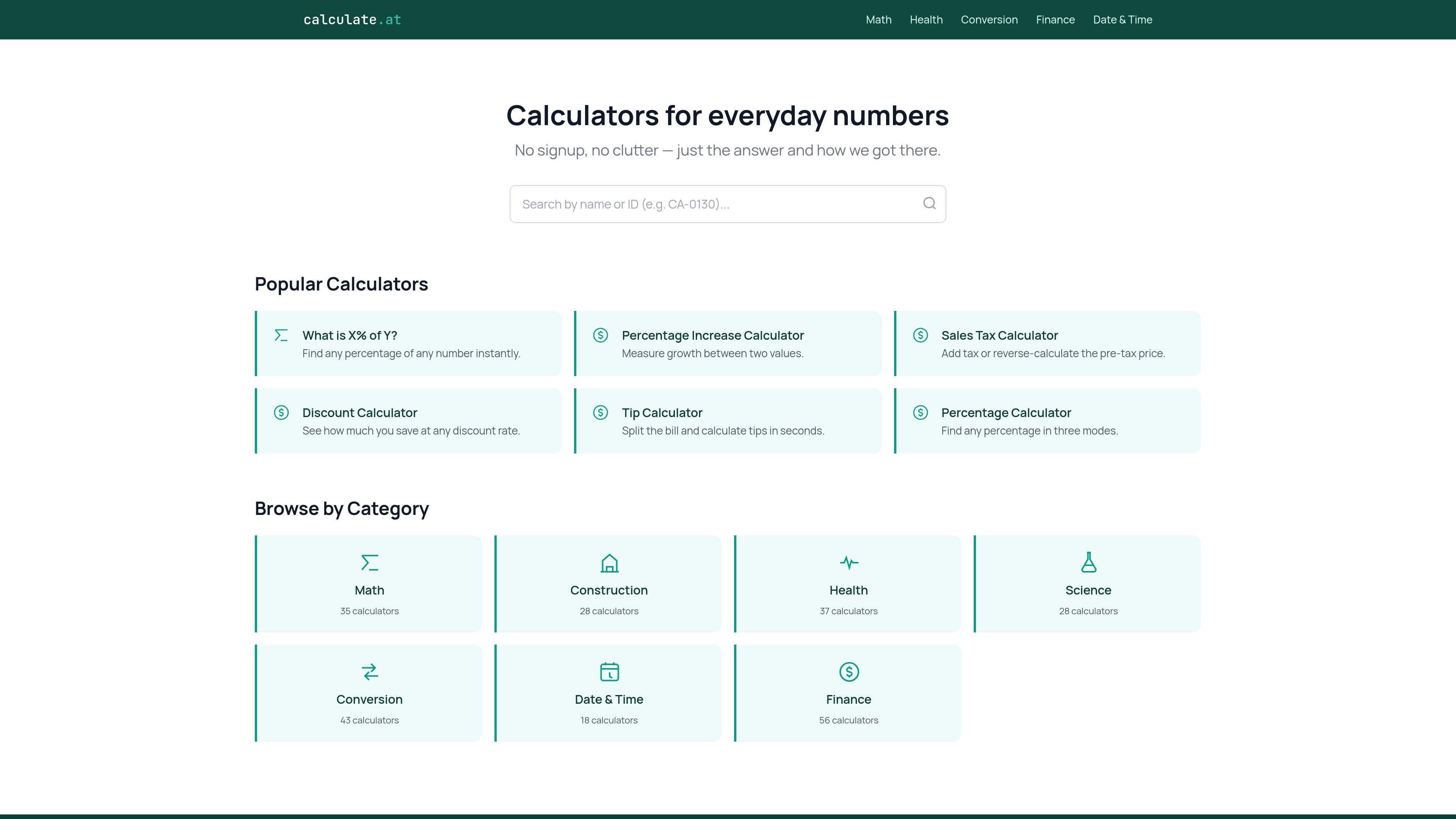

calculate.at is a browser-based library of online calculators for everyday math, finance, health, conversion, and date/time tasks. The site highlights no signup and shows formulas and worked examples alongside results.
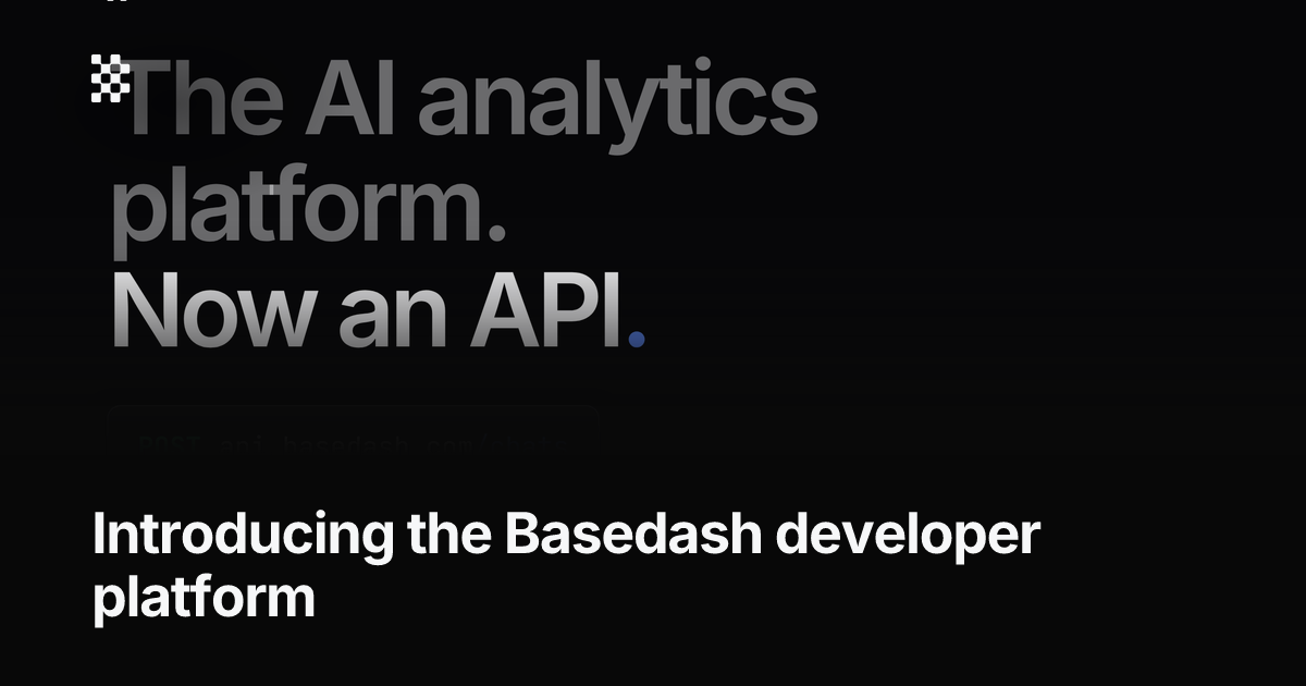

Basedash developer platform makes Basedash’s AI analyst, insights, automations, dashboards, and charting available through an API and MCP server. It is meant for customer-facing analytics and internal data workflows built on top of connected data sources.


SIP Calculator 2026 is a web-based mutual fund and wealth-planning tool for estimating SIP growth, goal-based savings, and related scenarios such as step-up investing, tax adjustments, and inflation impact. It also offers charts, export options, and several companion planning modules.
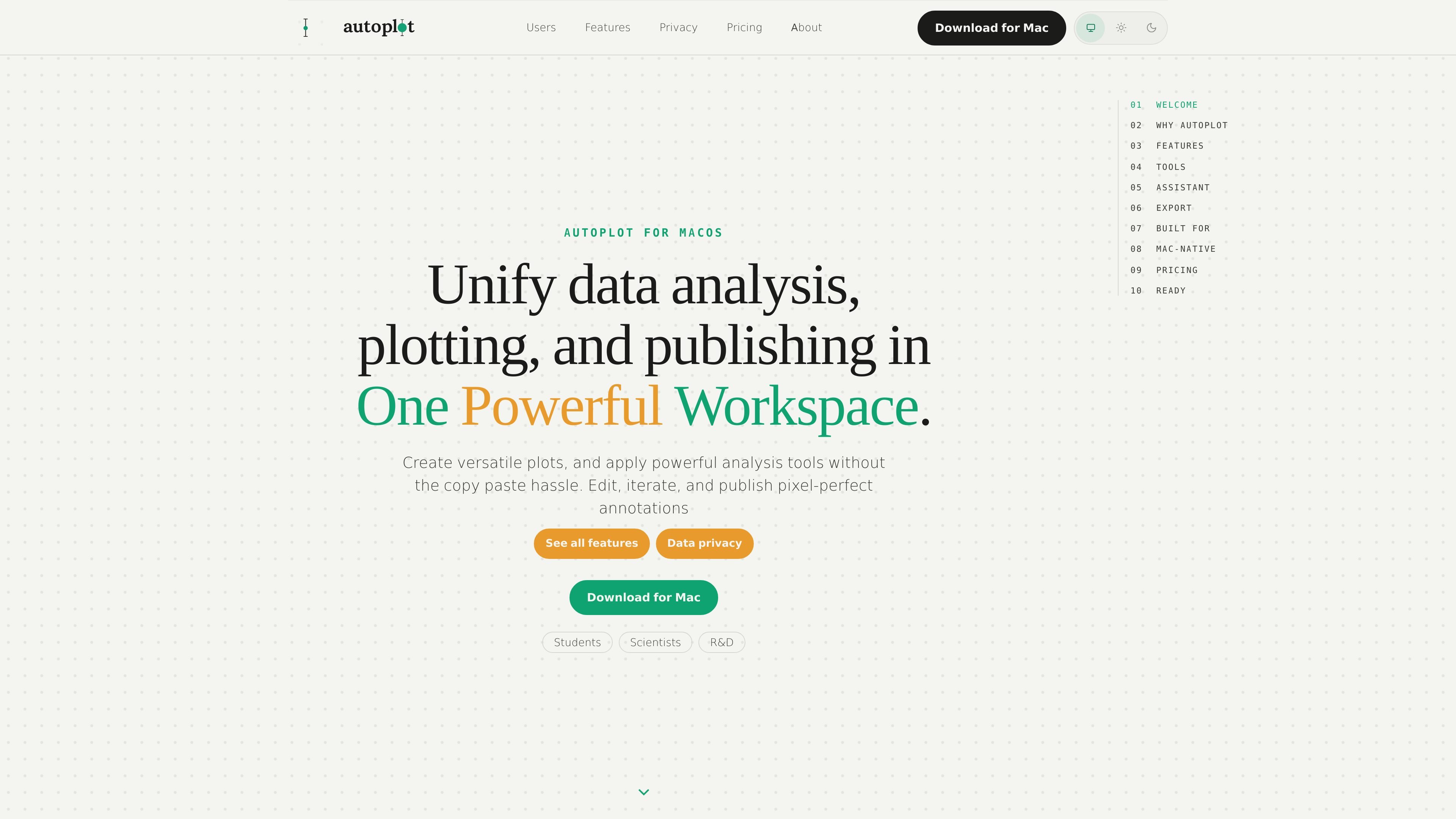

Autoplot is a native Mac workspace for importing tabular scientific data, creating plots and analysis outputs, and exporting publication-ready figures. It is designed for students, scientists, and R&D teams that want a local-first workflow with optional hosted AI assistance.
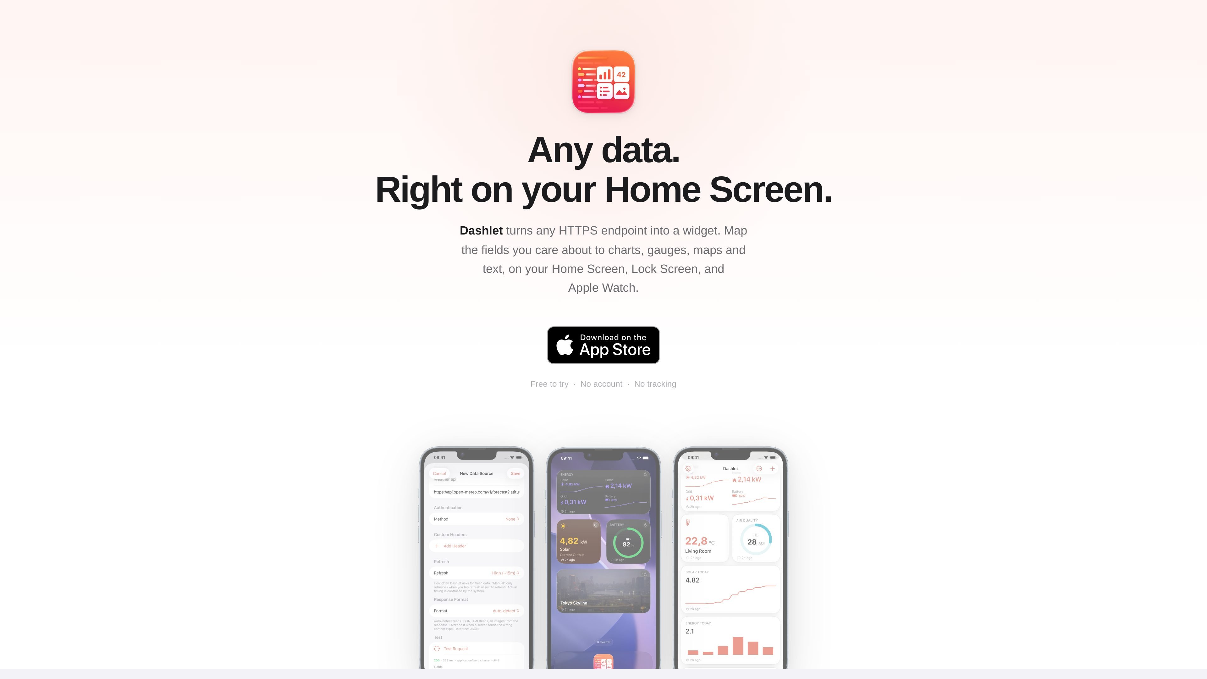

Dashlet is an iOS app that turns data from HTTPS endpoints into widgets for the Home Screen, Lock Screen, StandBy, and Apple Watch. It supports authenticated sources, field mapping from live responses, and several widget layouts including charts, gauges, images, and maps.
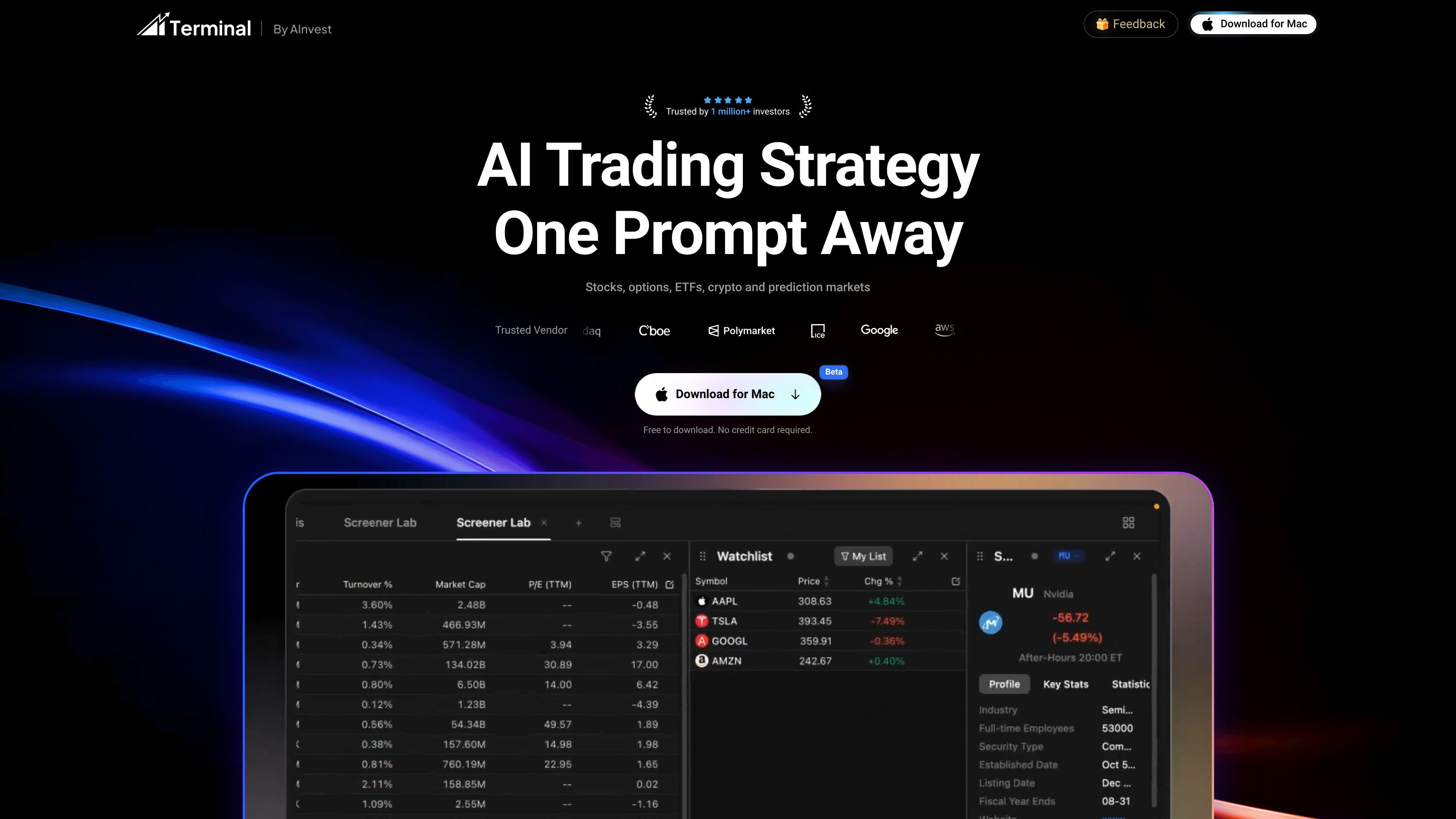

AInvest Terminal is a macOS desktop app for AI-assisted stock and market analysis. It combines chat-based research, screeners, charts, news, and market data in one workspace for investors who want a guided workflow.


Andy is a mood and anxiety tracker for iPhone and Android. It supports quick daily check-ins, optional notes and tags, timeline review, charts, reminders, streaks, share cards, and data export.
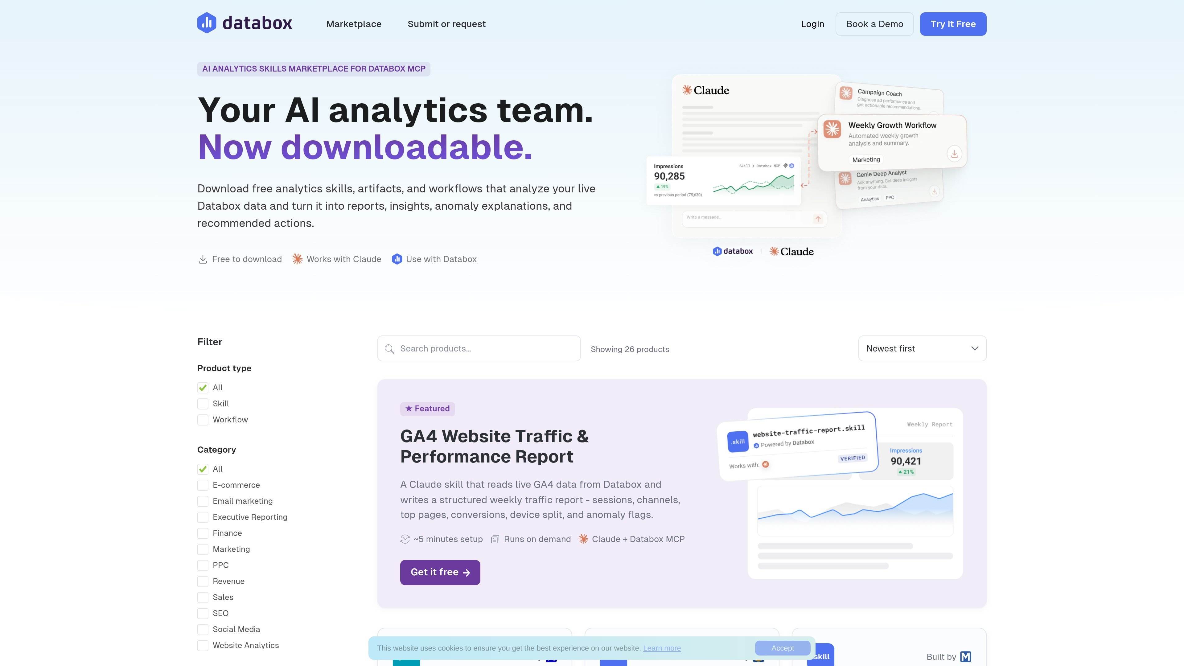

Databox is an analytics platform that connects live business data to reporting, insight, and action workflows. It helps teams and agencies turn metrics from tools like GA4, Google Ads, Shopify, CRM systems, and spreadsheets into dashboards, reports, alerts, and AI-generated analysis.
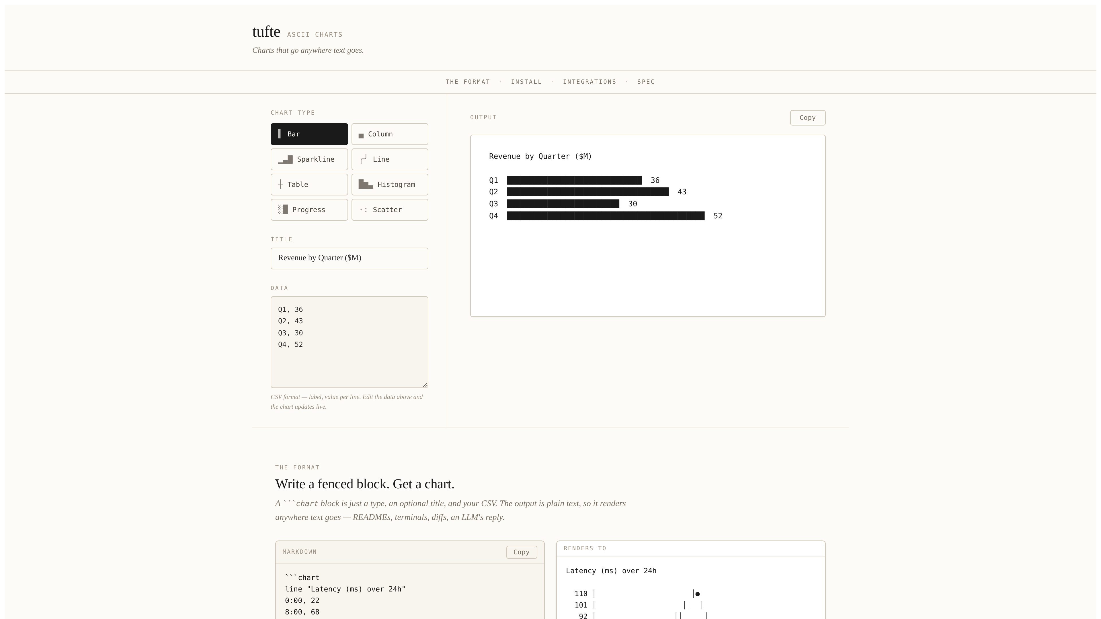

tufte turns CSV-style data into plain-text ASCII charts for Markdown, terminals, and other text-first workflows. It supports fenced `chart` blocks, inline sparklines, and multiple integration paths for publishing pipelines.
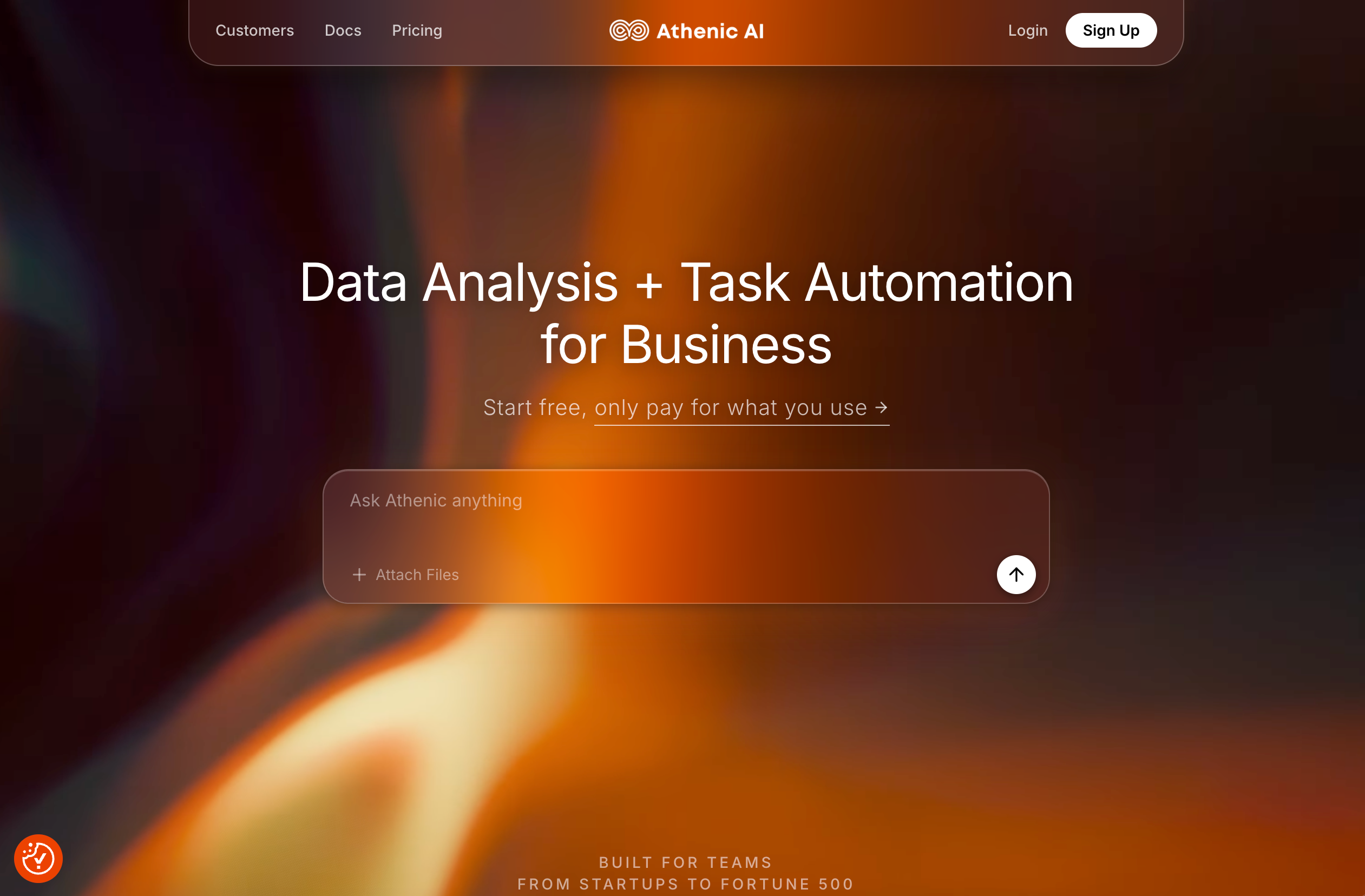

Athenic è un AI agent per analizzare dati e automatizzare il lavoro: collega i dati, fai domande in italiano e crea dashboard, report e automazioni.


HelioPeak is a native iOS app for tracking solar production through PVOutput.org. It shows charts, widgets, exports, and system statistics for iPhone, iPad, and Apple Silicon Mac users.
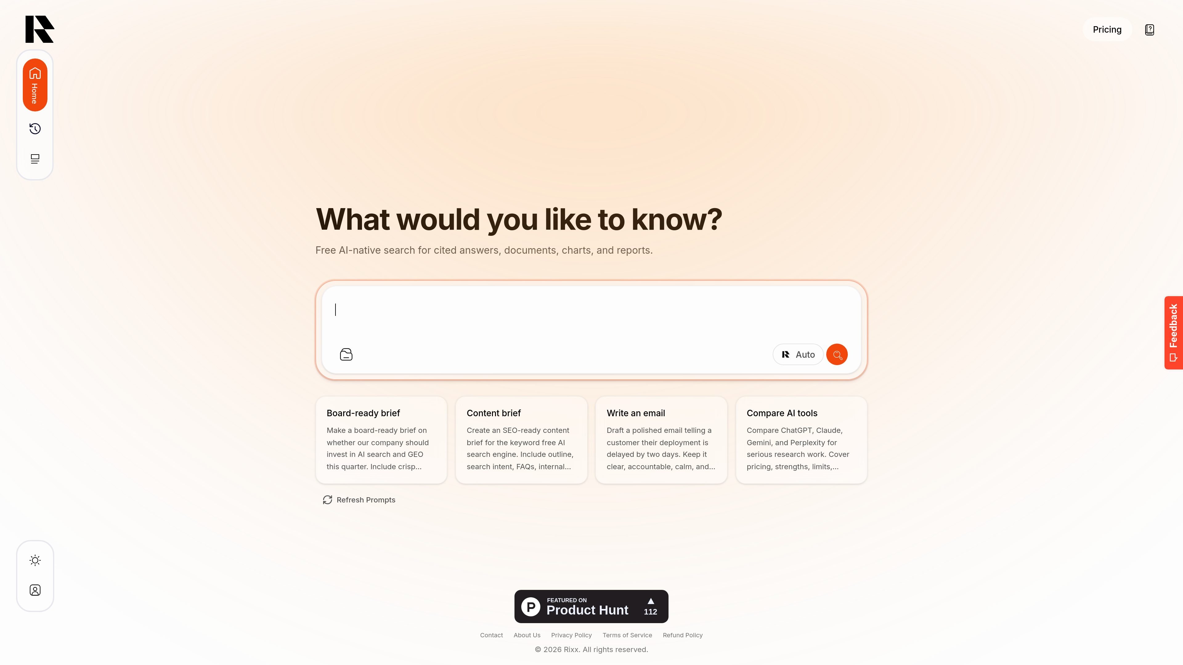

Rixx is an AI-native search workspace for cited answers, document analysis, charts, and reports. It helps researchers, analysts, founders, students, writers, and operators turn web and file-based research into reusable outputs.


Embedful’s Free Chart Generator turns CSV and Excel files into shareable charts without code. It supports multiple chart types, exports PNG/SVG/PDF files, and does not require signup.
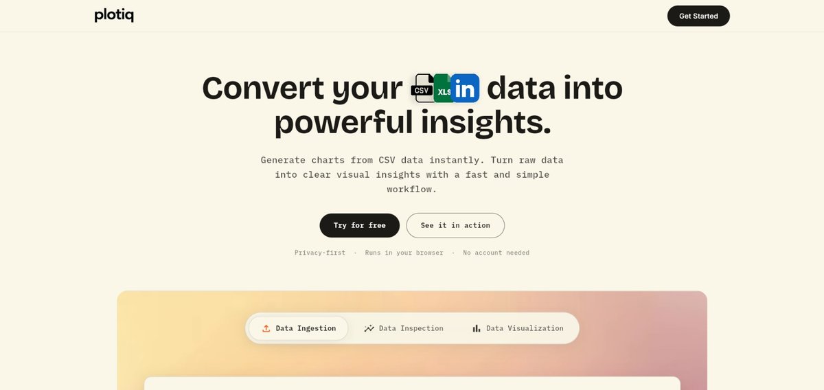

Plotiq is a browser-based CSV chart generator that helps students, researchers, engineers, and other data users turn tabular data into charts quickly. It supports a no-code workflow with CSV upload, column selection, chart choice, and download or sharing.