
Source-code delivery
Components are delivered as readable TypeScript source files that you copy into your project with the shadcn CLI, so you can inspect and modify the implementation directly.

Spark UI is an open-source React components collection with accessible, customizable UI primitives, motion, and polished defaults.
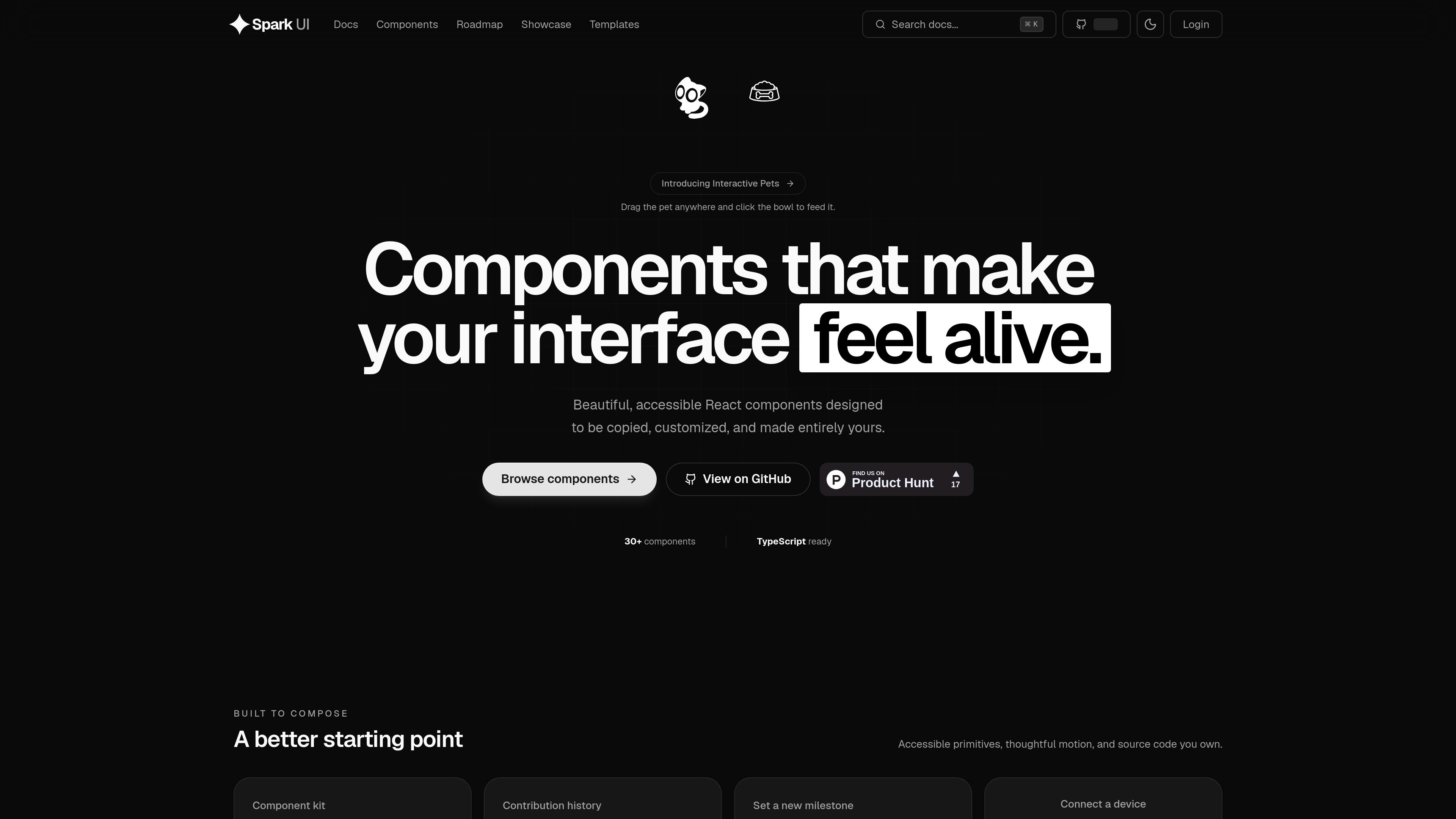
Spark UI is an open-source collection of React components and building blocks for modern products. Its homepage describes the kit as polished, accessible, and designed to be copied, customized, and made entirely yours.
Rather than shipping as a traditional npm package, Spark UI works as a shadcn-compatible source registry. You install components by copying source into your codebase, which gives you direct ownership of the implementation, the styling, and the places where motion or structure need to change.
The docs position the system as a set of small, composable primitives built on React, Tailwind CSS v4, and Radix UI. The component catalog includes common UI patterns such as buttons, accordions, dialogs, forms, navigation, feedback states, and more experimental pieces like interactive pets and motion-heavy backgrounds.
That combination makes Spark UI most relevant for teams that want a starting point with production-minded defaults, accessible behavior, and enough source control to adapt components without waiting on a library release.
Components are delivered as readable TypeScript source files that you copy into your project with the shadcn CLI, so you can inspect and modify the implementation directly.
The library is built on React, Tailwind CSS v4, and Radix UI, with components structured to fit the shadcn/ui pattern and composable primitives.
The introduction says motion is used to reinforce feedback, with attention to lift, press, focus states, and prefers-reduced-motion support.
Styling flows through semantic CSS variables, which supports light mode, dark mode, and brand customization without rebuilding the component structure.
Docs pages show variant-driven APIs, such as multiple button styles and accordion options, so components can be adapted to different interface patterns.
The library includes accessibility-oriented defaults such as keyboard navigation, visible focus, and WAI-ARIA-aligned behavior where applicable.
Use Spark UI when you want production-ready React building blocks but still need the source files in your repo so you can edit behavior, styling, and structure directly.
Use it when accessibility and keyboard behavior matter, especially for common UI elements like buttons, accordions, dialogs, and toggles that need solid defaults.
Use it to speed up work on internal dashboards or product pages that need standard controls, navigation, and feedback states without starting each component from scratch.
Use it for interfaces where motion and visual polish matter, such as interactive demos, onboarding surfaces, or branded experiences that benefit from subtle feedback and animation.
Use it when you want a shadcn-style workflow: install a component, inspect the source, then adjust only the pieces your product actually needs.
Spark UI is built as a shadcn-compatible source registry. You copy component source files into your codebase with the shadcn CLI, so the components become part of your own repo rather than a runtime dependency.
Yes. The docs say components are readable TypeScript source, and the introduction describes Spark UI as built on React, Tailwind CSS v4, and Radix UI.
The source describes Spark UI as open source and says you own the code you copy into your project, which makes it suitable for teams that want to customize components directly.
The site lists more than 30 components and says more are being actively developed. The introduction also points readers to the roadmap and contributing guide for updates and additions.
The pricing page at the provided URL returns a 404, so the source does not confirm any active pricing plan or tier structure.

Cherry Blossom is a browser-based PCB editor that turns plain-English prompts into editable schematics, PCB layouts, and fabrication files with AI checks and open exports.

ByteAsk is a terminal-first AI coding agent for C and C++ that edits repos and verifies changes with compilers, debuggers, sanitizers, and tests.

CreateOS Sandbox is an isolated compute environment for running code and agent workloads in Firecracker micro-VMs with private networking and SDK, CLI, or MCP control.

hob is an independent workspace for coding agents, with local control over sessions, terminals, history, routing, and follow-up work.

Ably Chat is a chat API platform for custom realtime chat apps, with rooms, typing indicators, presence, reactions, message updates and usage-based pricing.

Make Real is a Next.js app that turns hand-drawn wireframes into HTML prototypes with the tldraw SDK and AI models, with canvas sketching and embedded preview.