React, Radix, and Tailwind foundation
Radian describes itself as a high-quality, flexible, open-source design and development library built with React, Radix, and Tailwind.
Radian is an open-source React, Radix, and Tailwind component library for building web interfaces with documented Next.js setup and reusable UI blocks. It focuses on practical component reuse, CLI installation, and design-to-code consistency.
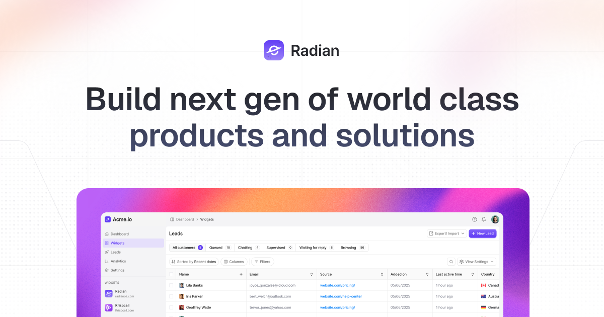
Radian is a design and development library for building React interfaces with Tailwind and Radix. The site positions it as an open-source component library that includes components, animations, and blocks for production-oriented web applications.
The product’s documentation focuses on practical setup and reuse. It shows a Next.js initialization flow, CLI commands for adding components, and component pages with variants and usage examples, which suggests Radian is meant to help teams move from design to working UI faster while keeping implementation consistent.
Radian describes itself as a high-quality, flexible, open-source design and development library built with React, Radix, and Tailwind.
The homepage emphasizes ready-to-use components, animations, and blocks, with default settings intended for production-ready applications.
The site offers a one-command installation flow and copy-paste usage, reducing setup overhead for new projects.
Documentation includes a Next.js init path that creates a project, writes components.json, sets up configuration, installs dependencies, and updates CSS variables.
Component docs show multiple Accordion variants such as open, table, box, disabled, icon-based, nested, and custom layouts.
The homepage highlights design-to-code sync, describing Figma changes as easily replicable in code for pixel-consistent implementation.
Use Radian when starting a new Next.js interface and you want a documented init flow that creates the project scaffold, writes configuration, and prepares the styling setup.
Use it when you need reusable UI primitives and blocks that can be added from the CLI or copied directly into a codebase without a heavy setup process.
Use the library when your team wants multiple interaction patterns for the same UI element, such as different Accordion appearances and behaviors.
Use it for product teams that move between design and development and want Figma changes to translate more directly into code.
Use the docs as a reference when implementing organized content disclosure patterns, such as FAQ sections or settings panels, where an Accordion is a good fit.
Radian is presented as a React and Tailwind component library built with React, Radix, and Tailwind, so it is aimed at teams that want prebuilt UI components and blocks for web applications.
The docs show installation paths for Next.js and component usage through a CLI command or copy-paste workflow, with a Next.js init command and add-component command.
The accordion documentation shows multiple variants, including open, table, box, disabled, plus/minus indicator, icon-based, nested, and custom layouts, suggesting the library supports configurable component patterns.
The pricing page currently returns a 404, so the public site does not confirm an active pricing model from the available evidence.
The source does not show a full integrations list. The evidence specifically mentions React, Radix, Tailwind, and a Next.js installation path.
Ghost is a terminal-based AI assistant for chatting, code generation, and CLI tasks. Includes free models, supports Linux, macOS, Windows, and is open source.
Devin is an AI coding agent and software engineer that helps developers and engineering teams plan and execute complex software tasks. It is available through desktop, cloud, JetBrains, and CLI surfaces, with plans for individuals, teams, and enterprises.
imgcook is a design-to-code tool that converts design drafts into front-end code. It supports plugin-based and developer workflows for Sketch, Photoshop, VS Code, and CLI usage.
Pi Coding Agent is a terminal-based coding agent for developers who want a minimal, extensible harness for interactive work and automation. It supports model switching, session branching, and multiple run modes including TUI, print/JSON, RPC, and SDK.
FigPrompt is an AI tool for creating production-ready Figma plugins from a written description. It helps Figma users move from idea to plugin logic without writing code.
Assemble by Cohesium AI is an open-source prompt orchestration system for AI coding tools. It generates native config files that turn one project into a structured multi-agent setup across 21 platforms.