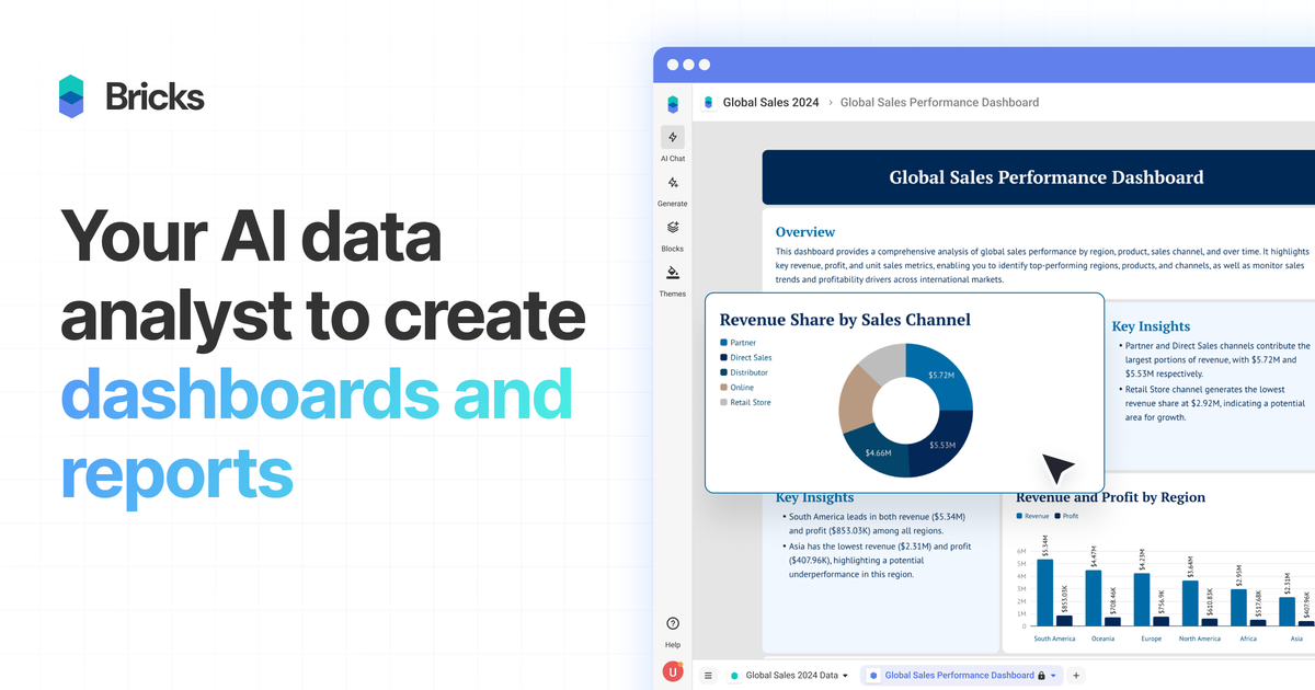
AI dashboard and report generation
Upload spreadsheet or report files and let Bricks generate dashboards, charts, tables, and written insights automatically.
Bricks is a web-based AI data analyst for turning CSV, Excel, PDF, and PNG data into dashboards and reports. It supports automatic chart generation, manual editing, sharing, and export for individuals and teams.
Bricks is an AI data analyst for turning spreadsheet-style data into dashboards and reports. The product is positioned for people who want polished visual reporting without building each chart and layout by hand in Excel, Canva, or a heavier BI tool.
Users upload data such as CSV, Excel, PDF, or PNG files, and Bricks automatically creates dashboards with charts, tables, and insights. It also supports manual editing, natural-language changes, team collaboration, sharing, and export so the dashboard can be refined and reused after the initial AI draft.
Upload spreadsheet or report files and let Bricks generate dashboards, charts, tables, and written insights automatically.
Edit dashboards with natural language prompts or by dragging tiles, changing colors, updating text, and moving blocks around manually.
Update the underlying data and regenerate the dashboard while keeping the layout intact.
Click into a data point to filter the rest of the dashboard and explore patterns across the same view.
Save a dashboard layout as a template and reuse it with new data for repeat reporting workflows.
Import data from Google Sheets or databases, and upload CSV, XLSX, PDF, or PNG files as source inputs.
Turn monthly spreadsheets into dashboards for performance reporting, with charts and insights generated automatically and then refined for the final audience.
Upload CRM, sales, finance, or operations files and build a dashboard that highlights trends, filters data points, and can be refreshed when new files arrive.
Create repeatable report layouts for recurring work, then reuse the same template with fresh data instead of rebuilding the dashboard each cycle.
Share dashboards with teammates, control access levels, and use the same workspace to review reporting outputs together.
Export finished dashboards to PDF or PPTX, create a public link, or present them directly inside Bricks for stakeholders.
Bricks is an AI data analyst for creating dashboards and reports from uploaded CSV, Excel, PDF, and PNG files. It automatically generates charts, tables, and insights, and lets you edit and customize the result manually or with natural-language prompts.
Yes. The pricing page says the Free plan includes 20 AI messages per month, Premium adds 500 AI messages per month and larger team collaboration, Pro includes unlimited AI messages, and Enterprise is for larger teams with priority support.
Yes. The pricing page says you can export dashboards or reports to PDF or PPTX, create a public share link, or present directly within Bricks.
Bricks is designed for small to medium-sized datasets, such as spreadsheet data, CRM exports, sales reports, marketing analytics, financial data, survey results, and operational metrics.
Yes. Bricks supports team collaboration on all plans, with team sizes and access levels varying by plan.
Bricks is an AI data analyst that turns CSV, Excel, PDF, PNG, Google Sheets, and database data into dashboards and reports. It helps people create, refresh, share, and present visual reporting without manual chart building.
PromptScout tracks how ChatGPT, Gemini, Google AI Overviews, and Perplexity mention your brand or competitors, then pairs those results with source analysis and website audits. It helps teams decide what to fix in content, positioning, or site readiness next.
SaveMRR is a Stripe retention tool for SaaS teams that scans billing data for churn and MRR leaks, then automates recovery through dunning, cancel-save offers, win-back emails, and onboarding nudges. It is built for founders and bootstrapped teams using Stripe.
Hype is a web tool for finding trending YouTube topics by category, time range, and scoring mode. Spot emerging ideas and review source videos.
Sleek Analytics is a privacy-friendly web analytics tool with real-time visitor tracking, Core Web Vitals, and revenue attribution. It helps site owners understand traffic and conversions without cookie banners or a heavy setup.
Struere is an AI-native platform for turning spreadsheet data into structured operational software with dashboards, alerts, and automations. It is aimed at teams that want to replace manual spreadsheet workflows without building custom tools from scratch.