
Bottom sheet primitives
Includes a bottom-aligned sheet pattern with swipe dismissal for mobile-style interactions.

Velvet UI is a React component product for building bottom sheets, drawers, dialogs, lightboxes, and stackable toasts with native-feeling motion.
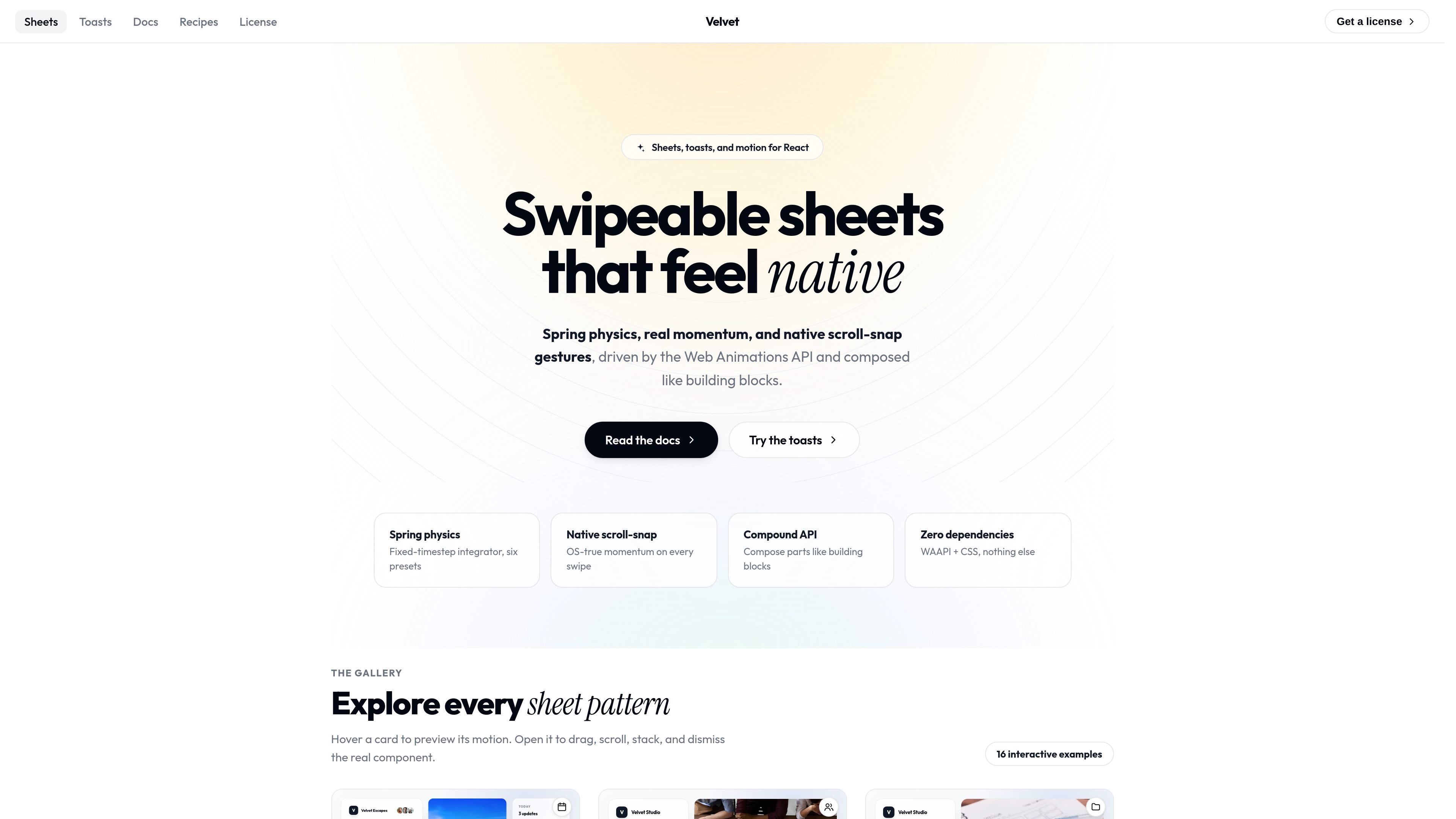
Velvet UI is a React component product focused on bottom sheets, modal surfaces, drawers, lightboxes, and related presentation patterns. The homepage shows these components through realistic app-style examples rather than abstract API diagrams, which makes the product’s intent clear: help teams build native-feeling interface layers in React.
The source description highlights swipeable bottom sheets, nested surfaces, spring motion, accessible primitives, and stackable toasts. Taken together, the product is positioned as a collection of interaction primitives for applications that need layered UI, gesture-driven dismissal, and polished motion without leaving the React ecosystem.
Includes a bottom-aligned sheet pattern with swipe dismissal for mobile-style interactions.
Supports multiple presentation styles such as modal dialogs, navigation drawers, top sheets, side sheets, and full-screen sheets.
Provides detent sheets with multiple snap points for staged expansion and collapse.
Covers longer content with coordinated scroll and drag behavior in scrollable sheets.
Includes stacked sheets and a second-sheet pattern for layered workflows.
Adds toast-oriented interactions, with the meta description specifically calling out stackable toasts.
Use the bottom sheet, detent sheet, or persistent sheet patterns for mobile-friendly panels that expand and collapse in stages.
Use modal dialogs, lightboxes, and full-screen sheets when a task needs a focused surface with limited background distraction.
Use navigation drawers and side sheets for app navigation, settings, or account areas that slide in from an edge.
Use scrollable sheets, keyboard-aware sheets, and card expansion to support long forms, content review, or media controls.
Use stacked sheets and detached sheets when a workflow needs more than one layered surface or a panel that stays visually separated from the viewport edges.
The source describes Velvet UI as React bottom sheet and toast components. It includes sheet variants such as bottom sheets, modal dialogs, navigation drawers, detent sheets, full-screen sheets, side sheets, lightboxes, and persistent sheets. The product pages do not show a separate installation flow in the provided text.
The rendered page text emphasizes swipe dismissal, nested surfaces, spring motion, and accessible primitives. It is positioned for native-feeling React interfaces rather than a general-purpose design system.
The pricing page is present, which indicates the product has pricing information, but the provided source text does not include plan names, prices, or limits.
Yes. The source includes multiple sheet patterns, including stacked sheets and a card expansion pattern with bidirectional swipe dismissal, which suggests support for composing layered interactions.

MacSpoof is a macOS MAC address changer that lets you change or randomize your Wi‑Fi MAC to reconnect and limit device logging on public Wi‑Fi.

NomNak is a free iPhone app for discovering restaurants through friends’ recommendations, with saved spots, a food passport and city search.

Ctrl+Shift+3 is a calm, text-first community platform with chronological feeds, profiles, RSS, and private Clicks for smaller communities.

Hexel Editor is a macOS hex editor for opening, searching, inspecting, and editing binary files. Built for developers, reverse engineers, and security researchers.
TyeGit is a native Git client built with Rust and Tauri for fast, precise control over staging, commits, branches, and remotes on Windows, macOS, and Linux.

Servey mirrors and controls a Mac from iPhone or iPad with a real terminal and automatic local or remote connectivity, no VPN or port forwarding.